
A FHIR-native PAS designed around the reality of emergency care, where patient movement is constant and identity is resolved over time. Telstra Health's product offering included EMR and bed management, but not a dedicated patient administration system (PAS). Most hospitals ran admissions on a legacy PAS that was difficult to use and disconnected from other systems. I led the design of a proof-of-life PAS MVP built on FHIR, which became the foundation for Kyra PAS, Australia's first FHIR-native, mobile-enabled PAS. As sole designer, I worked within a cross-functional team: a product owner, system architect, a lead engineer, three developers, and a scrum master.
My scope covered the end-to-end ED admission journey: the movement board interaction model, the patient card information hierarchy, and the terminology and data-integrity rules the interface enforced. The product owner scoped what the MVP needed to cover; I owned how it worked.
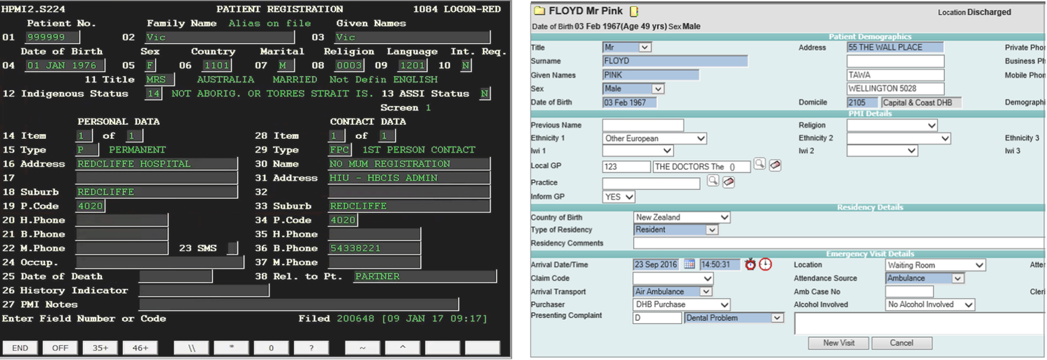
Emergency Departments operate under conditions most PAS platforms weren't built for: patient identity is often uncertain at arrival, work is constantly interrupted, and patients move fast across locations, while legacy systems assume complete data capture upfront and linear task completion. One clinical SME summed up the result plainly: "I know it's a black screen with green writing, but we call it the green screen. I think anything I do will be better." Staff had learned to work around their tools rather than with them, deferring administrative entry until workload allowed and correcting records later.
Hospitals also run overlapping systems (PAS, EMR, bed management) that can't safely amend identity data in real time, so duplication becomes the default and errors compound downstream. PAS breakdown in ED isn't a UI problem. It's a system integrity problem.
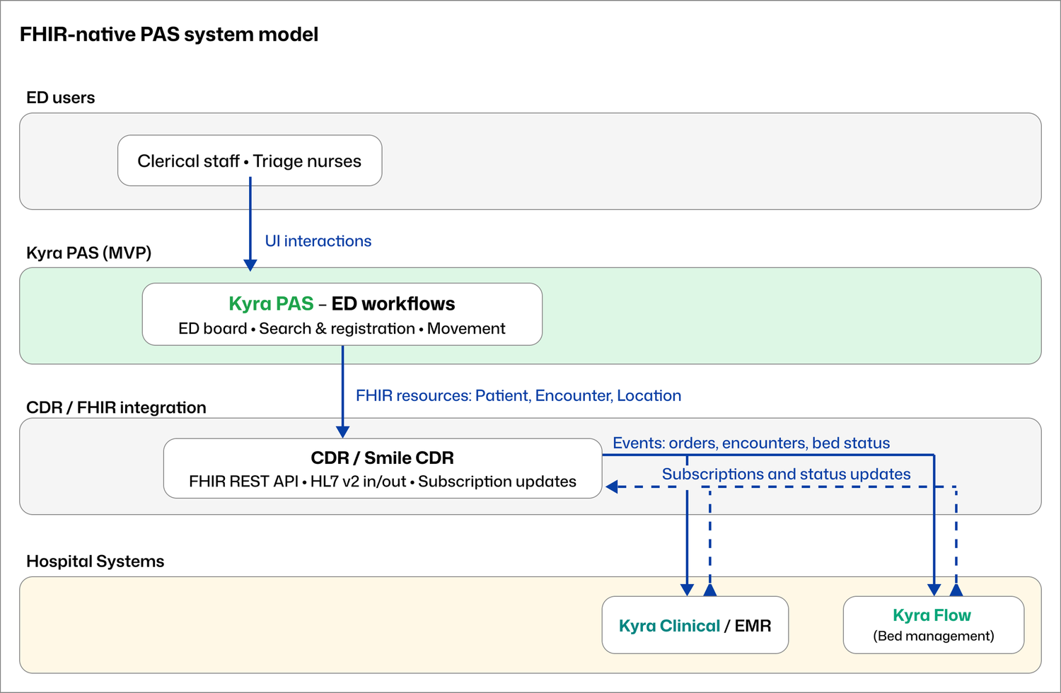
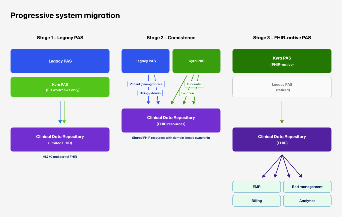
A FHIR-native model supports a distributed approach to patient data: information can be added, corrected, and shared incrementally across systems instead of demanding upfront completeness, while preserving auditability. For PAS, that meant designing for uncertainty and identity resolved over time, operating alongside legacy platforms rather than replacing them outright.
A FHIR-native model doesn't ask PAS to own the patient record. It asks PAS to participate in a shared clinical data ecosystem, adding, correcting, and sharing information incrementally instead of demanding completeness upfront.
That shift showed up most concretely in one interaction decision: treat patient movement as the primary surface, not an administrative task buried in a form. In legacy systems, a patient is a row in a table. In this model, a patient is a card occupying a physical location in the department: the patient is a property of the bay, not the other way round.
Turning that shift in ownership into a working system was delivery-driven work with a fixed six-month deadline. The objective was a working PAS MVP that demonstrated a modern, interoperable administrative model under Emergency Department conditions.
My role was to translate clinical and operational complexity into a coherent interaction model. The scrum master held the team coordination process, which freed me to stay close to the clinical and engineering detail. I ran regular design walkthroughs with the team, giving developers early visibility of what was coming in the pipeline and space to surface technical constraints before work moved into build. Design, validation, and build happened in parallel throughout.
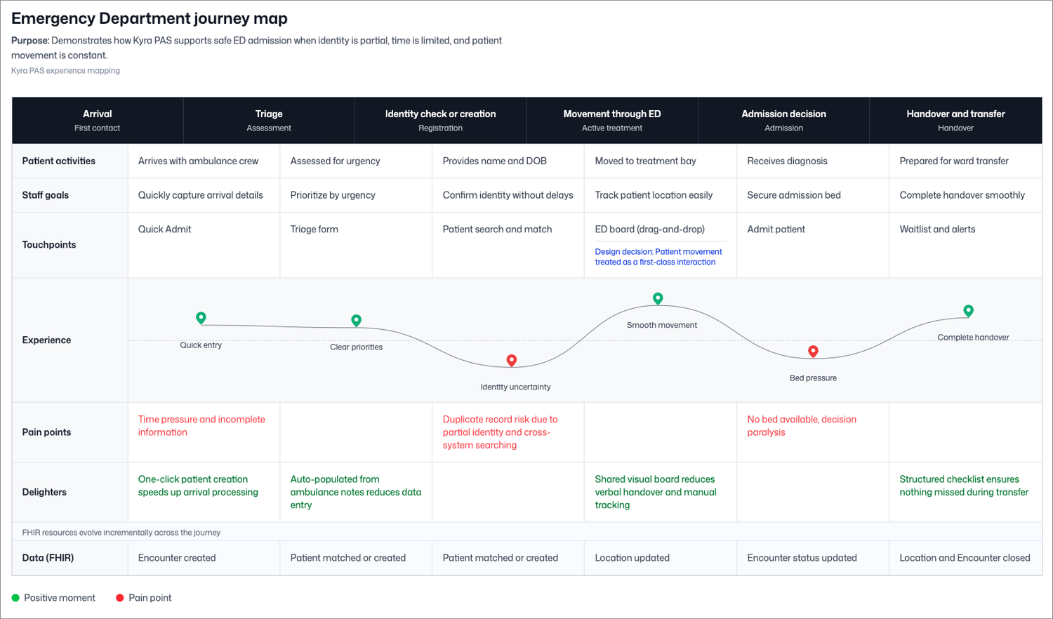
The product owner scoped the MVP to a single high-risk journey: ED arrival and triage, identity check or creation, patient movement across ED locations, admission completion, and transfer or discharge. My job was to make that journey work as a coherent, clinically safe interaction model within six months.
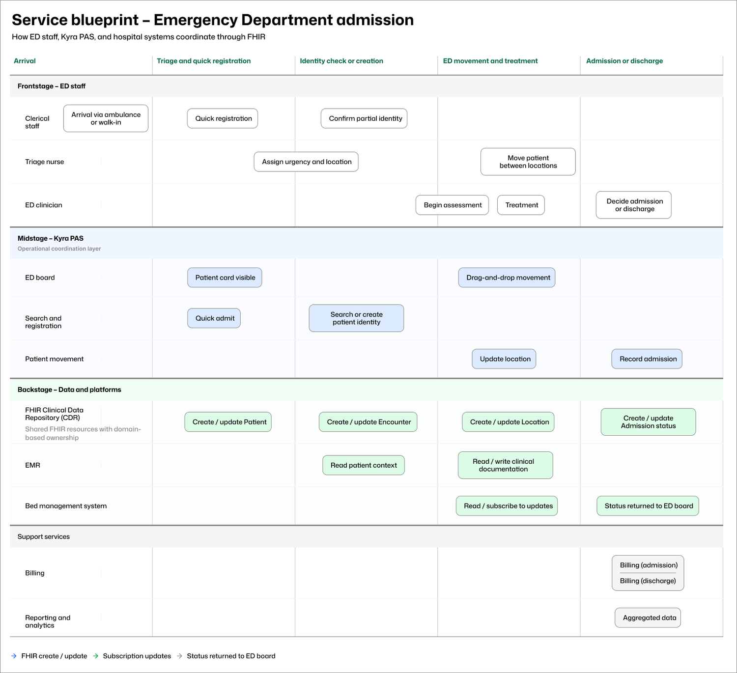
Emergency admission involves more than the ED. Frontstage clinical and clerical work, midstage PAS coordination, and backstage updates across EMR, bed management, billing, and reporting systems all have to move together without blocking patient flow. The service blueprint below maps where uncertainty enters the workflow, which system owns which decisions, and how downstream systems stay informed.
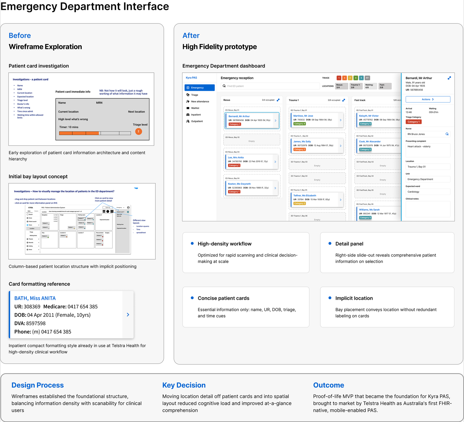
In legacy systems, moving a patient between locations means navigating to a record, opening an edit screen, updating a field, and saving. By that point, the clinical situation may have changed. I proposed a visual movement board instead, where staff drag patient cards between location columns. State updates automatically when a card moves, status and timing stay visible at all times, and detailed actions are available without leaving the board. A clinical expert I worked with had seen a similar geospatial ED view in a previous organisation, giving early validation that the model matched established clinical workflows.
There was no production system and no external testing budget. Validation relied on weekly design reviews with the engineering team, structured walkthroughs with clinical SMEs and PAS specialists, architectural alignment sessions, and regular internal critique. These sessions produced concrete changes.
A walkthrough surfaced the scenario: staff disregard a name-and-DOB match, then a Medicare number produces an exact match. Should the system flag again? The group's direction was clear: flag once, respect the choice, and reconcile later through merge functionality. I updated the wording and interaction accordingly.
In a clinical system, deleted records leave no audit trail and no recovery path. I redesigned the patient edit and record management flows to replace delete with an archive interaction that keeps previous data visible and recoverable within each field section.
"Triage" means two different things in a hospital: ED urgency categorisation and waitlist prioritisation. Using it loosely would create genuine clinical confusion, so I mapped terminology decisions explicitly at each stage rather than resolving them by convention.
With no dedicated design support, terminology drift across screens was a real risk. I kept a running checklist mapping every data field and label to its approved term, and checked new screens against it before review. It caught several inconsistencies before they reached engineering.
The patient card is the atomic unit of the entire interaction model. Getting it wrong would have cascaded through every other surface.
My initial wireframe listed nine data points I assumed the card needed to carry: name, MRN, current location, expected location, triage level, doctor's info, what was wrong, time since admission, and waiting time against triage limits. The reasoning felt sound at the time.
Clinical walkthroughs cut that down quickly. Most of that information was either contextual (already visible from which column the card sat in on the board), secondary (accessible by clicking through to the detail panel), or a risk if surfaced in abbreviated form on a small component under time pressure. What the card actually needed to carry was name, age, sex, URN, and triage category. Everything else lived in the detail panel, accessible on click without leaving the board.
I had originally included a bay number field on the card itself. During review I caught the same modelling error the insight above was built on: an empty bay square waiting to receive a card reinforced the spatial logic of the board and removed a redundant data point from the card.
Rather than introducing a new visual language, I matched the card style and DOB formatting conventions already in use across Telstra Health's hospital-facing products. This reduced the learning curve and reinforced that Kyra PAS belonged to the same platform family.
The ED board itself was designed as a column-per-location layout where each column represented a physical space in the department: waiting area, triage, resus, trauma bays, fast track. Staff moved patients by dragging cards between columns. State updated automatically. The detail panel slid out on the right when a card was selected, keeping the full board visible while staff reviewed or updated patient information.
This phase was explicitly framed as a proof-of-life MVP. Success was defined by system viability and coherence rather than adoption metrics or efficiency gains.
Complete ED admission journey demonstrated end-to-end. Identity uncertainty handled without blocking flow. Incremental data correction supported. Interaction model demonstrated to 400+ stakeholders. MVP became the foundation for the broader Kyra PAS platform.
Clinical efficiency gains. Reduction in patient administration time. Reduction in errors. Adoption in live hospital environments. Long-term clinical outcomes.
The MVP was delivered to a fixed showcase date and presented across the Telstra Health portfolio. More than 400 clinicians, health service leaders, researchers, and senior digital health stakeholders attended.
Discussion moved quickly from whether the approach could work to how it could progress, including integration pathways, staged rollout, and expansion to other admission scenarios. The conversation that had previously centred on legacy constraints shifted to platform ambition.
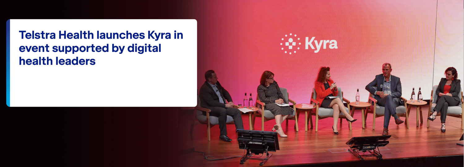
The MVP became the foundation for Kyra PAS, which Telstra Health brought to market as Australia's first FHIR-native, mobile-enabled Patient Administration System, expanding from the Emergency module I designed to a full platform covering inpatients, theatres, waitlist management, outpatients, maternity, and billing.
The MVP also proved it could be introduced without forcing hospitals to abandon existing systems overnight. The lead engineer and system architect designed a FHIR-native architecture allowing Kyra PAS to run alongside a legacy PAS during transition, with FHIR resources progressively taking ownership of data domains as confidence grew. My interaction model was built to operate within that architecture from the start.
This work established a viable PAS interaction model, a defensible technical foundation, and a concrete demonstration of PAS operation under genuine ED conditions. It was foundational rather than complete, and I knew that going in.
Six months constrained the depth of scenario coverage and made external clinical validation impossible within the delivery timeline. If I were doing this again, I would push harder earlier for even one round of observation in a live ED environment. The SME sessions were invaluable, but there is no substitute for watching staff manage a real board during a peak period.
What I would keep without question is the decision to treat the movement board as the primary surface from the very beginning. That single framing decision shaped everything else: the card structure, the information hierarchy, the FHIR resource model, and ultimately what made the prototype immediately legible to clinicians who had never seen it before.